Struggling to find content to share on your social media pages?
Our consumer lifestyle blog, Living Room, offers content including home improvement, market trends, DIY projects, neighbourhood guides and profiles on unique homes. Living Room publishes exciting new content four times a week (with unique French content for our Francophone fans).
While CREA Café is curated specifically to help your business grow and thrive, Living Room content is perfect to share with your clients.
Owned and operated by the Canadian Real Estate Association (CREA), REALTOR.ca is the No. 1 real estate platform in Canada (Comscore, 2020) with MLS® System listings from across the country.
Share this blog with your clients and follow REALTOR.ca on Twitter, Instagram and Pinterest.
You can read the original blog here.
Deep reds, bold blues, and neutral earth tones are leading the way for the top paint colours of 2023. See what companies like Sherwin-Williams, Benjamin Moore, Glidden, Behr, and Pantone have chosen as their colours of the year.
Refreshing the home is a big part of embracing the new year, and with so many potential changes from flooring to furniture, it’s hard to know where to start. Paint is a quick and easy way to freshen up any space or piece of furniture, and interior designers and paint companies have their predictions on emerging colour trends for 2023. Ranging from earthy reds to warm neutrals, here are the colours the pros say we’ll be painting our homes with and why they work.

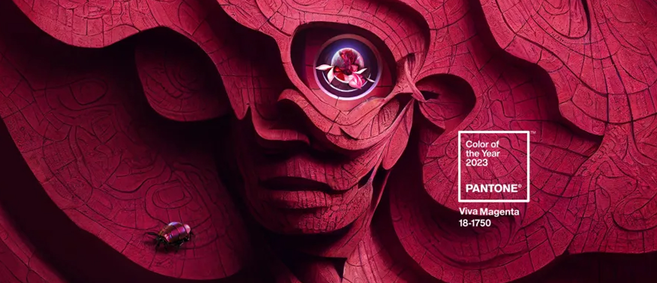
Pantone’s highly anticipated Colour of the Year for 2023 was announced at the beginning of December. PANTONE 18-1750 Viva Magenta is meant to be a “brave and fearless” colour for those who have a “rebellious spirit” and exude optimism and joy. The bold colour lives in the red family, or what Pantone refers to as “The Magentaverse.”
“PANTONE 18-1750 Viva Magenta descends from the red family, and is inspired by the red of cochineal, one of the most precious dyes belonging to the natural dye family as well as one of the strongest and brightest the world has known,” said Leatrice Eiseman, Executive Director of the Pantone Colour Institute. “Rooted in the primordial, PANTONE 18-1750 Viva Magenta reconnects us to original matter. Invoking the forces of nature, PANTONE 18-1750 Viva Magenta galvanizes our spirit, helping us to build our inner strength.”
Though this isn’t a paint colour you can run to the store to purchase—Pantone’s Colour of the Year isn’t specifically a paint, just a colour—it serves as inspiration of what 2023 can bring. Pantone offers a set of designer tools to help you use their colours in your interior design projects.
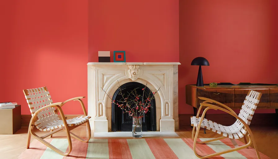
Raspberry Blush by Benjamin Moore
Benjamin Moore’s 2022 colour of the year, October Mist, was an earthy green that resembled the stem of a flower. For 2023, their colour resembles the petals of a rose. Raspberry Blush is a vibrant red-orange that delivers bold personality. It’s charismatic without being loud, much like the electro-funk duo the paint company partnered with to commemorate this year’s selection. The Canadian electro-funk duo Chromeo has released a new song titled Raspberry Blush that reminisces about the positivity and enjoyment of colour and music together. Use this coral tinged pink on an accent wall, arch, or bring some colour to your powder or dining room.
You could also consider Terra Rosa by Dunn-Edwards if you’re into the soft clay colour.
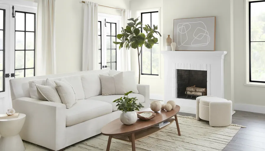
Blank Canvas by Behr Paint Company
Sticking to more of a neutral hue, Behr has named Blank Canvas its 2023 Colour of the Year. A stark contrast to some of the other more vibrant colours, this creamy shade of white ushers in a clean and inviting blank slate. With this choice, Behr leans into a relaxing, calming colour that can offer endless décor possibilities. Blank Canvas can be paired with bold blues, browns, and greens. Use it in the bedroom to promote tranquillity or to finish off trim and moulding.
“Blank Canvas effortlessly offers a clean and inviting blank slate that allows individuality and creativity to flow freely,” Erika Woelfel, Vice-President of Color and Creative Services at Behr Paint Company, said in a press release. “This white easily harmonizes with a wide range of hues, including neutrals, earth tones and pastels for a charming and cozy appeal. Blank Canvas also pairs beautifully with black for a dramatic impact, and with bright accents like green or cobalt blue to instantly lift your mood.”
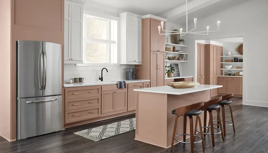
Redend Point by Sherwin-Williams
The Sherwin-Williams paint company is evoking a sense of connection, warmth, and softness with its pick for the year. Whether used in the living room or in the kitchen, the colour is the ideal choice to bring a sense of community and nature into your space. The colour also pairs well with earthy neutrals like dark beiges and greys.
“Redend Point was inspired by the idea of finding beauty beyond ourselves,” says Sue Wadden, Director of Colour Marketing at Sherwin-Williams. “Build on its earthiness by utilizing the hue alongside natural-looking textiles and wood accents or create a desert oasis by layering terracotta shades and clay materials.”
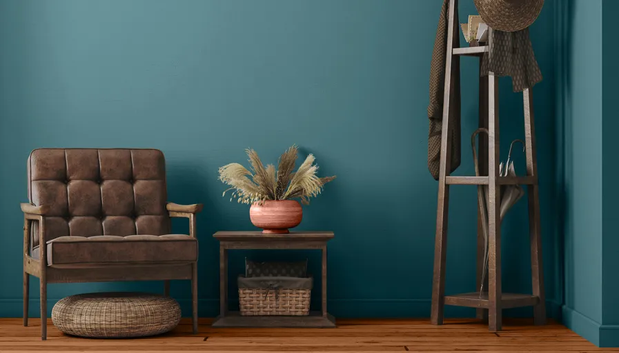
Vining Ivy by Glidden
Sticking with the earth tone colour theme of 2023, Glidden’s colour of the year is Vining Ivy. A mixture of blue and green, this in-between jewel-toned colour can be used in almost any space. The company chose a versatile colour so people don’t have to think so much about what works with their home.. The colour can be used as an accent to give a pop to your space or paired with soft pastels, light neutrals, or deep browns and blues.
“Consumers are seeking to simplify… as the past two years have shed a new light on the importance of serenity and little moments,” said Ashley McCollum, Glidden colour expert. “Vining Ivy embodies this vibe perfectly. Its versatility takes the guesswork out of design, leaving consumers with more time to indulge in the things that matter most to them.”
McCollum suggested using this colour on kitchen cabinets, as an accent wall, or in a smaller room to contrast a neutral palette.
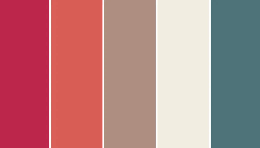
This year we are seeing a movement towards clays, stones, and earth hues inspired by nature. Colours that bring calm, zen, and tranquillity are leading the way and people are being urged to paint their home in a way that brings comfort to them. These colours add a touch of calmness, optimism and hope in what’s ahead. So before you tackle your new painting project, consider whether these trending colours help showcase or inspire the feelings you’re chasing.

